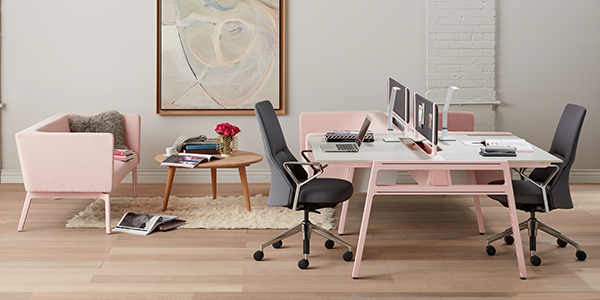
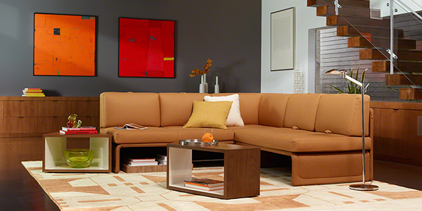
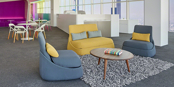
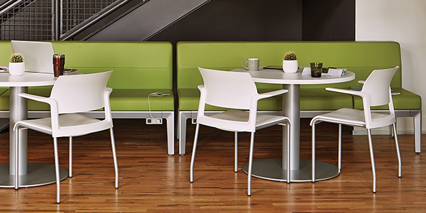
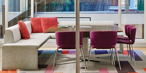
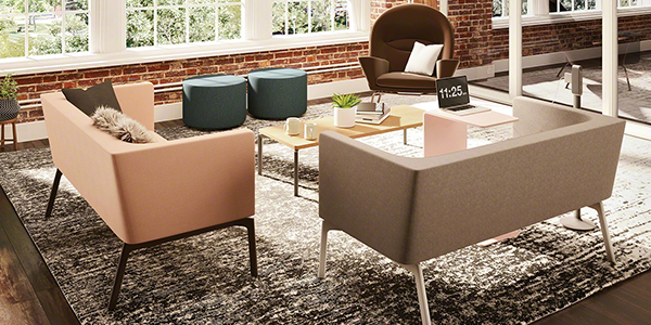
“A mixture of vitality, relaxation and the great outdoors” is how the Pantone Color Institute describes their color trends for Spring 2017. Showcasing the beauty of the natural world, these colors include both vibrant shades and more subdued earthy hues. These brilliant colors provide a source of inspiration in our lives.
According to Leatrice Eiseman, Executive Director of the Pantone Color Institute, “One of the things that we saw this year, was a renewed sense of imagination in which color was appearing in context that was different than the traditional. Reminiscent of the hues that surround us in nature, our Spring 2017 Fashion Color Report evokes a spectrum of emotion and feeling.”
These vivid colors are highlighted in Steelcase’s Office Renaissance design aesthetic–throughout the informal, authentic and inspiring spaces that companies are striving to create. These spaces celebrate not only color, but also design, materiality and performance. Aiming to support the emotional, physical and cognitive wellbeing of people, companies are offering different types of spaces in which to work—spaces for socializing, focusing and collaborating.
Subscribe to e-connect for monthly updates on workplace trends, innovations and insights.
STEELCASE INSPIRING SPACES LOOKBOOK
Here are some curated workspaces from Steelcase that embody the idea of the Office Renaissance and feature Pantone’s Spring 2017 color trends.


